By: Tiffany Pan
In the gathering of health information by coders and its scrutiny by analysts, it’s easy to forget the importance of health communication. Defined by Wikipedia as the study and practice of communicating promotional health information, it has never been so crucial.
The pandemic has triggered a public demand for health data. We are hard-pressed to find the last time the media has so faithfully and passionately reported on case numbers, trends, and projections. If public health has moved to the forefront of the Zeitgeist, so has a larger pattern of misinformation and disinformation. COVID is as political as it is a health issue, and with every anti-mask and anti-vaccine message, the threat to our collective health increases. We must influence public behaviours and attitudes, demonstrate the benefits of healthy practices, and argue against misconceptions.
Traditional methods of health communication
With COVID, a fundamental issue is the maintenance of public trust and support for control measures. One UBC report approached health communication with a democratic lens, advocating for strategies such as autonomy rather than orders; focusing on emotions, values, and stories.
Bonnie Henry and the BC government response has largely followed these strategies. BC imposed restrictions later, emphasizing individual responsibility and implied civic duty. Dr. Henry certainly targeted emotions, values, and stories with her trademark slogan “be kind, be calm, be safe” and her heartfelt announcements of daily death tolls. Other strategies advocated by Harvard also align with the BC response: communicating uncertainty clearly, not over- or under-reassuring, and providing numbers, context, and history. Indeed, Dr. Henry in her daily update is often restrained and sparingly uses sensationalistic words (such as “exponential”). In the current state of restrictions, she has emphasized that each person has their own situation and context to consider. Her measured response was seen, at the earlier stages of the pandemic, as a model for public health leadership, being profiled nationally and internationally. BC premier John Horgan also grasps the need to understand audiences and watch social media. He put the call out to local celebrities to spread messages to the younger demographic more prone to riskier behaviours. Real-time, peer-to-peer sharing has also led to a new way to view global health data. BC has their own dashboard, as does Canada. Internationally, there is the Johns Hopkins Coronavirus Resource Center, an interdisciplinary collaboration between several groups. Google has also incorporated dashboards into its “COVID” search results page. Indeed, it seems that public communication on health information has largely risen to this modern challenge—at least in the BC case.
Visual methods of health communication
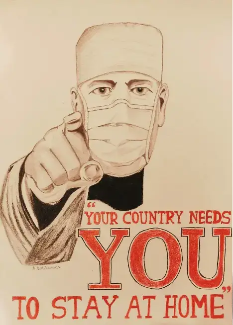
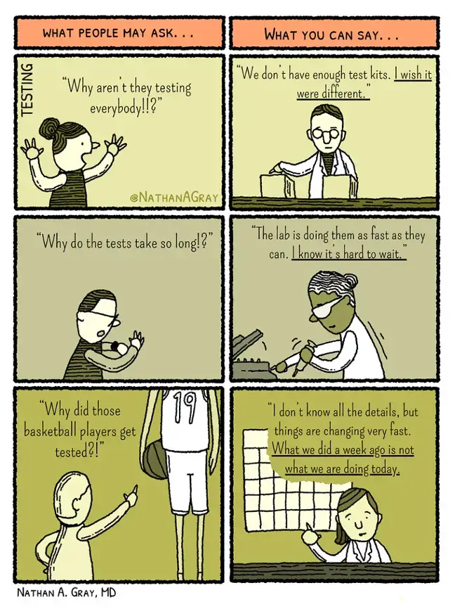
News and information now bombard most phones and households in a variety of ways, from in-depth coverage by the Globe and Mail to 40-character bites on Twitter. The challenge of effectively, succinctly, and persuasively presenting complex information can be met by the use of graphics. The US CDC has a dedicated webpage for graphics and buttons. The UN has put out a call for artists to submit COVID-related artwork to a Creative Content Hub. The WHO described tactics to make communications more understandable, such as visual presentation, YouTube, print materials, and infographics/graphics/GIFs. One physician coined the term graphic medicine to describe the role of comics in studying and delivering health care. A few examples below show the ease of presentation visually rather than textually.

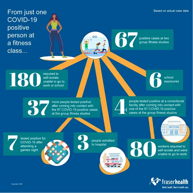
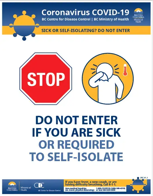
In BC, there are a few examples of how graphics have enhanced communications. When gyms were being shut down, many business owners were infuriated by the rapidly changing rules and slow communication from contact tracers. Their complaints often took place on Facebook, an avenue where their presence dominates and easily proliferates. But Fraser Health—the health authority with the highest number of cases in BC—came out with a series of infographics, including one that directly addressed the shutting down of gyms and studios. It was effectively shared across multiple mediums (like Twitter and Facebook), as well as inserted into traditional mainstream media articles. Other examples of visual communication include easy signage for public spaces, with clear communication of the need to stay away if symptomatic. The popular Swiss Cheese Model has been widely used in health authority townhalls to describe the reasoning behind various measures; however, more can be done.
While trends are mapped in line graphs ad nauseum, widely available and easily understood graphics are missing from much of the communication. A graphic for vaccine distribution is clearly much more effective than a text document. Keywords such as “rolling seven-day averages” are easy to use but hard to conceptualize. At the same time, “flattening the curve” has become popular because it is easy to visualize. For the public to understand the wealth of data, the current restrictions, and the upcoming vaccine rollout, we need even more visual messages.
Conclusion
COVID has undoubtedly altered the health care landscape, and inevitably health information management. Health information professionals face a number of daunting tasks. What we do must be communicated well to have meaning. The data we gather and information we capture is only valuable if it informs practice. In a pandemic, when the responsibility for health is collective and beyond the normal health care actors, we can only hope that this information is shared and understood when it is needed most.
Sources
- Wikipedia (https://en.wikipedia.org/wiki/Health_communication)
- The Lancet Communicating in a public health crisis (https://www.thelancet.com/journals/landig/article/PIIS2589-7500(20)30197-7/fulltext)
- UBC Democratic Health Communications during Covid-19: A RAPID Response https://democracy.arts.ubc.ca/2020/09/14/covid-19/
- Harvard Developing Public Health Communication Strategies—And Combating Misinformation—During COVID-19 (https://www.hsph.harvard.edu/ecpe/public-health-communication-strategies-covid-19/)
- CDC Communications – Graphic and Buttons (https://www.cdc.gov/coronavirus/2019-ncov/communication/graphics-buttons.html)
- UN COVID-19 Response Creative Content Hub (https://unitednations.talenthouse.com/)
- UX Design The important art of visual health communication (https://uxdesign.cc/the-important-art-of-visual-health-communication-e447f80fc1ab)
- WHO Tactics to apply to make your communications understandable (https://www.who.int/about/communications/understandable/visuals)
- Graphic Medicine – intersection of healthcare and comics (https://www.graphicmedicine.org/


